
Exploring MTA Turnstiles Data
As a data science student at Metis my first project involved exploring the MTA’s turnstile data. The goal was to use this data to recommend placement of street teams for a fictional non-profit organization so they can get interested NYC commuters signed up to their email list.
Approach
My approach to this challenge was to recommend a shortlist of stations with the highest amount of foot traffic to the non-profit. For this project I primarily used the MTA turnstile data to come up with our shortlist, but I also considered weather data from the NOAA to see if bad weather (significant precipitation) had an effect on the ranking of certain subway stations.
Datasets
I wrote a Python script to grab the last three years of data from the MTA Turnstile repository, which stores the counts of entries and exits for each turnstile in each subway station in the MTA transit system. The data is added as text files to this repository each week on Saturday and contains readings of the turnstile coutners at approximately four-hour intervals. The MTA defines the attributes of these turnstile datasets in a data dictionary per the following:
| NAME | DESCRIPTION |
|---|---|
| C/A | Control Area (A002) |
| UNIT | Remote Unit for a station (R051) |
| SCP | Subunit Channel Position represents an specific address for a device (02-00-00) |
| STATION | Represents the station name where the device is located |
| LINENAME | Represents all train lines that can be boarded at this station |
| DIVISION | Represents the Line originally the station belonged to BMT, IRT, or IND |
| DATE | Represents the date (MM-DD-YY) |
| TIME | Represents the time (hh:mm:ss) for a scheduled audit event |
| DESC | Represent the “REGULAR” scheduled audit event (Normally occurs every 4 hours). Audits may occur more that 4 hours due to planning, or troubleshooting activities. Additionally, there may be a “RECOVR AUD” entry: This refers to a missed audit that was recovered. |
| ENTRIES | The cumulative entry register value for a device |
| EXIST | The cumulative exit register value for a device |
I also created the following columns:
| NAME | DESCRIPTION |
|---|---|
| entry_diff | Total entries for a given time interval (difference between rows for “ENTRIES”) |
| exit_diff | Total exits for a given time interval (difference between rows for “EXITS”) |
| TOTAL_TRAFFIC | Sum of entry_diff and exit_diff |
| DOW | Day of week for a given date of counter reading |
For weather data, I requested the last three years of weather observations from the NOAA’s National Climatic Data Center, using CENTRAL PARK (Station ID: GHCND:USW00094728) as a proxy for the entire city’s weather. I selected the only two attributes in this data set which were relevant to rainfall, which are as follows:
| NAME | DESCRIPTION |
|---|---|
| DATE | Date of observation |
| PRCP | Inches of precipitation for the day of observation |
Assumptions
-
Time Constraints: Because the non-profit was trying to garner interest for a gala happening around the beginning of the summer, I assumed the street teams would be out canvassing in the three preceding months: April, May, and June. Thus, I only pulled turnstile data for only those three months in 2015, 2016, and 2017.
-
Counter Values: I assumed the “ENTRIES” and “EXITS” columns reflected cumulative counts that could only increase as time moved forward. Thus, I removed any rows with negative values in my “entry_diff” and “exit_diff” columns (approximately 1.4% of the rows).
-
Target Metric: I did not differentiate between “ENTRIES” and “EXITS” for a station, but rather relied on “TOTAL_TRAFFIC” to determine which station would have the most foot traffic at a given time and thus be the best place for the street teams to visit.
-
Outlier Counts: I assumed that any “entry_diff” or “exit_diff” value over 86,400 (based on total seconds in a day) was an outlier that needed to be removed.
Findings
Figure A shows the top ten stations ranked in order of most average daily “TOTAL_TRAFFIC”. From this chart we can see that the busiest stations are located around midtown Manhattan.
Figure A
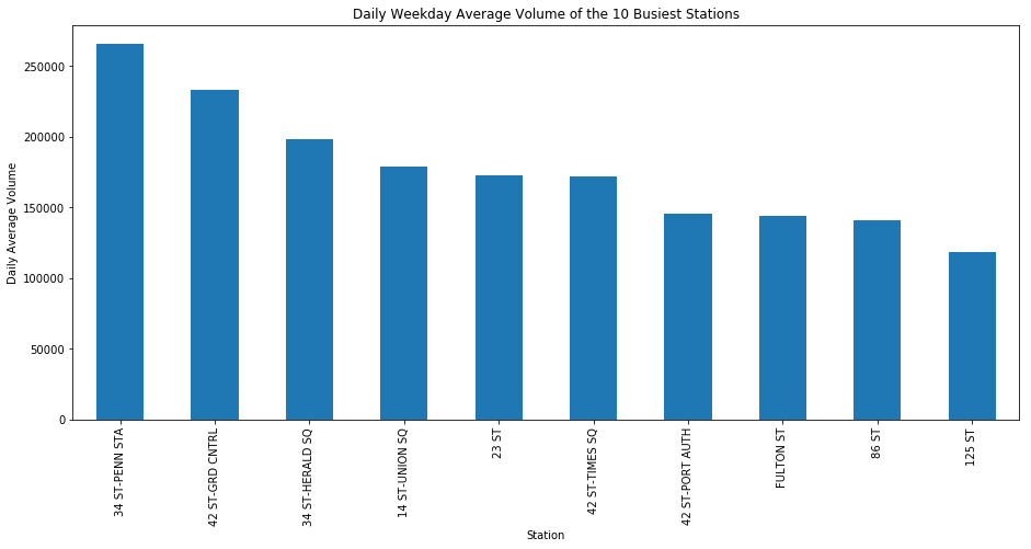
Figure B shows the effect of rain on ridership. For this chart, I labeled the data using a binary variable called “BAD_WEATHER”. I also set a cutoff for PRCP at its daily mean for the periods in my weather data set which came out to 0.12 inches **of precipitation. For BAD_WEATHER to be true, the PRCP had to be greater than this cutoff value (which was true for approximately **21% of the dates included). The chart shows that the presence of precipitation tends to coincide with a decrease ridership across the top ten most active stations. Although weather seems to have an effect on overall ridership, it does not necessarily change the ranking of our top ten most active stations as the stations in Figure A and Figure C look to be similar.
Figure B
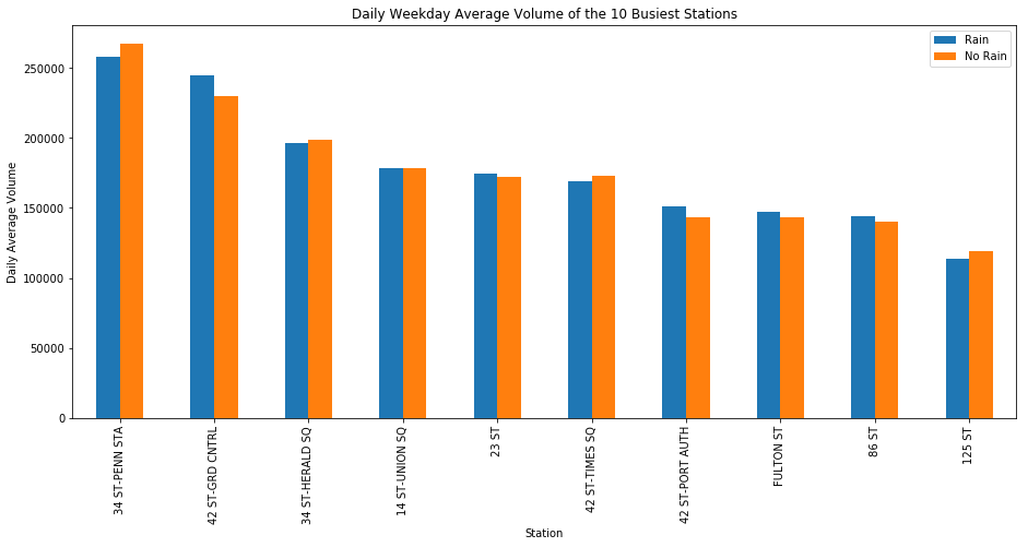
Figure C shows a distribution of average daily total traffic across the top ten stations by total traffic in our data set for each day of the week. Intuitively, we would think that Saturday and Sunday would show less traffic than the week days because there will be a higher volume of commuters going to work during the week. Additionally, we can see that Wednesday and Thursday have the most riders entering and exiting turnstiles–a station has an average of around 90,000 exits and entries per day on Wednesday and Thursday. The boxplots in Figure D also indicate that the distributions of traffic across all days are skewed right (i.e. there tends to be days/times that have far far more average total traffic than other days/times). This may also indicate that there are some outliers in my data that need to be removed since this trend is consistent (i.e. my cutoff for detecting error-induced outliers as a result of unclean data needs to be lower).
Figure C
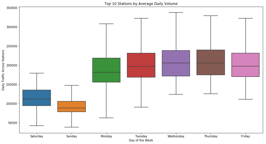
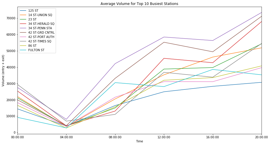
Figure D shows the average traffic for our top ten stations at five different time intervals:
- 00:00:00 - hours between midnight and 4AM
- 04:00:00 - hours between 4AM and 8AM
- 08:00:00 - hours between 8AM and Noon
- 12:00:00 - hours between Noon and 4PM
- 16:00:00 - hours between 4PM and 8PM
- 20:00:00 - hours between 8PM and midnight
Not surprisingly, we see the most foot traffic occur at “peak” or rush-hour time intervals of 8:00AM to Noon and 4:00PM to 8:00PM.
Figure D
Recommendation
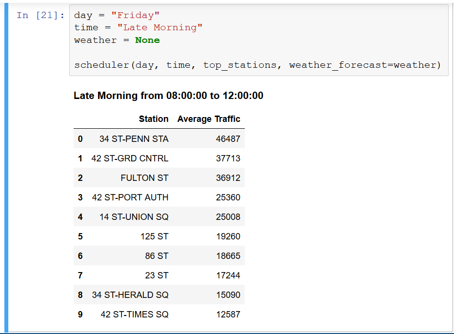
At the end of the day, our team thought that it might be better for the NPO street teams to be able to choose their target stations based on their schedule and available resources. To help the team make decisions about where to allocate their resources at their available times, I built a scheduler for them in a jupyter notebook. The tool allows the user to enter three parameters: day of week, time of day (in 4-hour blocks), and weather forecast (i.e. “rain” or “no rain”). Based on these conditions, the scheduler outputs the ten stations with highest average foot traffic.
My code for this project can be found here.
Leave a Comment
Your email address will not be published. Required fields are marked *